
UC Berkeley's graduate architectural journal
______ Issue 08
STRANGELY SPECIFIC
Author
Erin Besler & Ian Besler
What follows is a selection of excerpts from our ongoing project, Best Practices, which examines how contemporary issues of agency and authority impact the design of the built environment. Using perhaps the most heavily referenced, documented, and reproduced site as a case study—the city of Rome and its environs—the project draws on the history of architecture, design, media theory, and cultural anthropology and pairs photographic documentation of preservation sites, prosaic street tableaus, tourist traps, and cultural heritage destinations with text and citations.
Defining a territory between the sanctioned and the unsanctioned, the tasteful and the tacky, the novel and the nonsense, the project asserts that interest, knowledge, and meaning are more often generated on the lines that divide such categories. In visually cataloging the endearing and enigmatic ways in which the built environment takes shape, we’re proposing a way of thinking about neighborhoods, housing, historical artifacts, streetscapes, and storefronts, not so much as places defined by regulations and dimensions, but as assemblages of impromptu interventions and messy relationships between building materials, social media, signage systems, communication equipment, plant life, and people.
The authors would like to thank Jonathan Crisman and the American Academy in Rome.


Fleur-De-Light-Switch, Villa Aurelia
Visual gestures that tread the line between attention and compulsion seem to ask the question: in our relationships with everyday objects, what are the qualities in certain things that merit care and consideration while others earn none? Why are some affections and affinities appropriate, but some things--say, the consistency of a fresco embellishment as it carries across a light switch cover are not?
Perhaps this blurring of attentive boundaries is why Obsessive-Compulsive Disorder (OCD) occupies such a marquee status in the description of everyday anxiety and distress. It clarifies our relationships with objects and materials into a sort of list of hierarchies: multitudes of different things and surfaces requesting or demanding various degrees of our attention. Simply because a certain status is perceived as less desirable (a fresco being rudely interrupted in its visual evocations for mere functional elements) doesn’t mean that the way in which this state is communicated can’t feel somehow refined and finished itself.

Digital Displacement, Palazzo Nunez
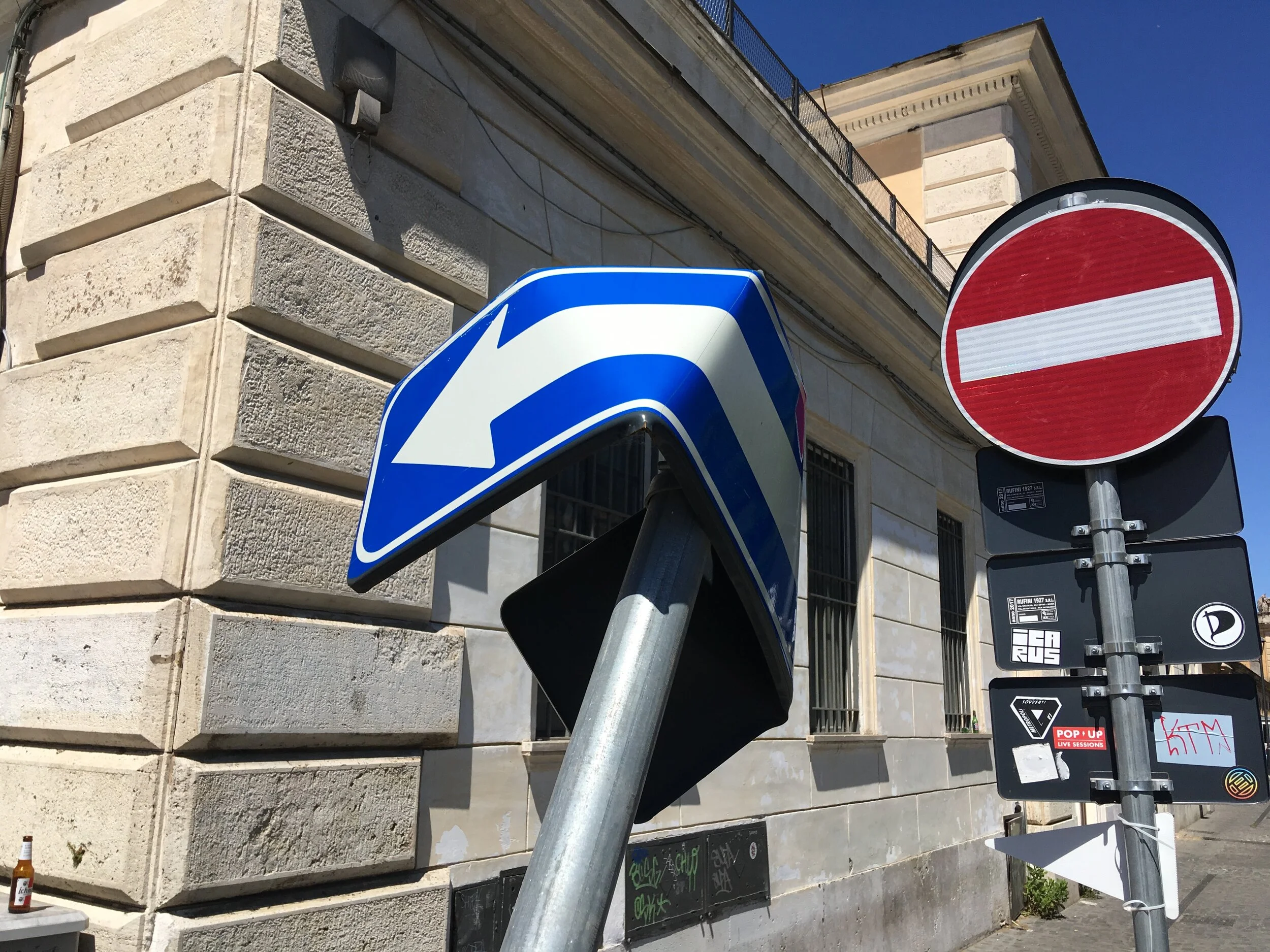
There’s a funny casualness around the potency of images in public spaces, and particularly in their depictions of the fragility of the human body. An untold catalog of violence, like the alarmed flailing of a stick figure trapped between closing doors depicted on warning signs in a commuter train, or the sad cranial slump of the figure shown in warning signs who is getting knocked on the head by a swing-arm gate typically found in parking lots, these images confront us on a daily basis.
In so many ways, the surprising convergence of the image and the surface evokes a startled sense of amusement rather than aversion. Like the trivial distinction that’s often made between depictions of violence and gore: violence is a banal act, an unremarkable inevitability in our culture, and therefore we’re surrounded by evocations of it constantly. But gore, its outcome, is somehow more gratuitous and irregular, more punitive and unnecessary, and is therefore treated as less culturally acceptable in its depiction. (1) The distinction seems exceptionally arbitrary.

1. For a wonderfully exhaustive examination of this phenomenon, the filmography of Paul Verhoeven.
“Violence is a banal act, an unremarkable inevitability in our culture, and therefore we’re surrounded by evocations of it constantly.”

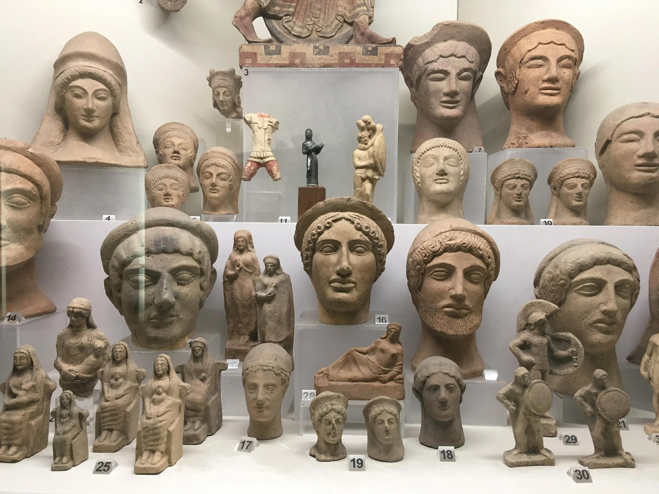
Family Portrait, Villa Giulia
There’s an ever-increasing tediousness to the onslaught of anecdotes about the peculiarities and quirks of digital databases that are used to train machine learning algorithms. It’s surprising how rapidly headlines that once seemed so novel--typically something along the lines of “a programmer trained this AI to write Quentin Tarantino movie scripts” have become entirely banal. But beyond the trope of “I trained a bot to do x using y,” the question of how digital databases are populated and what information and imagery they are populated with feel more insistent and intimate each day.
The anxiety of stumbling across imagery of yourself, or data about your personal life, within the AI training databases of some defunct startup that you’ve never even heard of will probably become a routine nuisance. (2) Such an experience would seem to provide a bit more specificity to the abstract threat suggested whenever somebody invokes the trope about social media and apps: that “if it’s free, then you’re the product.”
"if it's free,
then you're
the product."
2. One day in 2005, a mother in Evanston, Illinois, joined Flickr. She uploaded some pictures of her children, Chloe and Jasper. Then she more or less forgot her account existed. Years later, their faces are in a database that’s used to test and train some of the most sophisticated artificial intelligence systems in the world.” From Kashmir Hill and Aaron Krolik, “How Photos of Your Kids Are Powering Surveillance Technology: Millions of Flickr images were sucked into a database called MegaFace. Now some of those faces may have the ability to sue,” The New York Times, Oct 11, 2019, web, accessed Oct 27, 2019


Foro Italico
The parking lot is such a potent and recognizable visual form, with its characteristic curb cuts, grassy, pastoral islands, and disregarded corners that inevitability accumulates clutter and questionably permitted storage. It’s frustrating that they seem to so rarely play a significant role in cultural depictions and imaginings of the city. (3)
3. “It was being gradually borne in on me by Rome that one of the vital things that make a great city great is not mere raw size, but the amount of care, detail, observation, and love precipitated in its contents, including but not only its buildings. It is the sense of care-- of voluminous attention to detail-- that makes things matter, that detains the eye, arrests the foot, and discourages the passerby from passing too easily by. And it goes without saying, or ought to, that one cannot pay that kind of attention to detail until one understands quite a bit about substance, about different stones, different metals, the variety of woods and other substances-- ceramics, glass, brick, plaster, and the rest-- that go to make up the innards and outer skin of a building, how they age, how they wear: in sum, how they live, if they do live. An architect’s flawless ink-wash rendering of a fluted pilaster surmounted by a capital of the Composite order is, necessarily, an abstraction. […] It has not become architecture yet, and it will really not do so until it is built and the passage of light from dawn to dusk has settled in to cross it, until time, wind, rain, soot, pigeon shit, and the myriad marks of use that a building slowly acquires have left their traces. Above all, it will not become architecture until it is clearly made of the world’s substance-- of how one kind of stone cuts this way but not that, of bricks whose burned surface relates to the earth below it. Now Rome-- not the society of people in the city, but their collective exoskeleton, the city itself-- is a sublime and inordinately complicated object-lesson in the substantiality of buildings and other made things, in their resistance to abstraction.”
From Robert Hughes, Rome: A Cultural, Visual, and Personal History (Alfred A. Knopf, 2011), 10.


Holding Pen, Vatican Museum
The contemporary use of the term quarantine derives from the Italian quadraginta, “for forty days,” the amount of time that ships were required to wait in the harbor before being permitted to offload. There’s something delightful in the capacity for language to synthesize a discrete meaning simply from a grouping. Forty days becomes something much more complex. Quadraginta sounds benign enough, yet quarantine, as a term, feels so cold and tinny to the ear. Similarly, fortnight derives from “fourteen nights,” which seems intuitive enough, but then the words always clangs a bit in hearing it, perhaps due to the awkwardness of it being singular, yet referring to multiple days, and also utilizing the singular of night. Then there’s biweekly, which stubbornly resists offering a reliably consistent meaning.
“There’s something delightful in the capacity for language to synthesize a discrete meaning simply from a grouping.”


Handable Architecture, EUR
There are entirely too few examples of scale models to be found within the actual buildings that they depict, or even simply in close proximity to the buildings that they depict. We generally take comfort in the reliability of discovering a charming, lucite encased, didactic scale model in most historic landmarks or museums, or occasionally as a sort of accessory in the lobby of some starchitect vanity project. But otherwise, the scale model as a decorative element is entirely insufficiently utilized, particularly for the talismanic qualities that they seem to suggest. (4)
4. “Today we find the miniature located at a place of origin (the childhood of the self, or even the advertising scheme whereby a miniature of the company’s first plant or a miniature of a company’s earliest product is put on display in a window or lobby) and at a place of ending (the productions of the hobbyist: knickknacks of the domestic collected by elderly women, or the model trains built by the retired engineer); and both locations are viewed from a transcendent position, a position which is always within the standpoint of present lived reality and which thereby always nostalgically distances its object.” From Susan Stewart, On Longing: Narratives of the Miniature, the Gigantic, the Souvenir, the Collection (Duke University Press, 1993), 68–69.
“...the scale model as a decorative element is entirely insufficiently utilized, particularly for the talismanic qualities that they seem to suggest.”


Low-Res Cloud, Trastevere
No recent development in visual culture has done more to hasten the oncoming, beguiling collision and impending conflation between city and simulacra than the spread of relatively cheap, large-scale vinyl sticker graphics. High-resolution prints of hamburgers the size of sedans and gyros as big as sleeping bags adorn almost every viable surface of so many commercial storefronts. There was a brief lapse after painted signage went out of favor, but before large-scale vinyl printing became typical-- around the ’80s and ’90s--when the graphic landscape was comprised almost entirely of letterforms. The last shudder of High Modernism gave way to a sort of realization of one of the typology maps in Learning from Las Vegas. 5 This imagery, as we experience it today, is laying the foundations for ubiquitous digital screens, placeholders in an urban environment ordained to realize every viable surface as comprehensively smothered in flashing, throbbing, animated displays-- some high resolution, some low resolution, varying color tints and intensities, pulsing or static, vectors and bitmaps-- all jumbled together in uneasy and indifferent adjacency across any available facade and building surface, most probably in desperate need of repair or replacement.
5. Robert Venturi, Denise Scott Brown, and Steven Izenour, Learning from Las Vegas (MIT Press, 1972).
“High-resolution prints of hamburgers the size of sedans and gyros as big as sleeping bags adorn almost every viable surface...”

Immersive Signage, Testaccio
Damage and defacement often have an interesting way of producing legibility between the interactions of material, mechanical, and structural elements of the built environment. What is striking in encountering some form of deconstruction on a building facade or a signage surface is the rendering of transparency, a sense of the obscure inner workings being made visible. It’s like an animal dissection, but without the guilt of inflicting harm, replaced instead by the assurance of some productive and inevitable repair and replacement on the horizon. Like when the red and yellow plastic covering flies off of a roadside McDonald’s sign during a wind storm and for a few days you can enjoy viewing the empty, abstracted aluminum frame with three or four timid, fluorescent white light tubes still inside. Eventually, the replacement covering arrives and is installed and you forget that it was ever any different.
“Eventually the replacement covering arrives and is installed and you forget that it was ever any different.”


Interpretive Ambiguity, Ostia Antica
Interpretive signs and historical displays so often seem to be making an effort to compact and flatten out counter-narratives and contested details. So in Rome, there’s something nice to the legibility inherent in the effort and upkeep around all of the attendant signage, markers, and displays. The extent to which anyone’s bothered (or received sufficient funding) to cobble together a reasonably coherent translation, much less even labeled, dated, and described a site or artifact at all with a view to the public’s accessibility, communicates another chapter of the story.5 Then there’s the signage at Ostia Antica, much of which has been bleached uniformly white due to the southern exposure of the site’s layout and the sunny Mediterranean climate. The lettering of the signage is ever-so-slightly embossed, so that reading the white-on-white text is possible, but only with an unreasonably extreme investment of time and ocular effort. It’s nice to imagine that such an effort provides us with a meaningful or poetic metaphor for the legibility of history itself, but that seems a bit too cute, if not altogether cloying.